How to Choose the Right Color for a Mother of the Bride Dress
You want a look that celebrates the couple, complements the wedding palette, photographs beautifully, and makes you feel radiant from aisle to last dance. The easiest way to choose the right color for a mother of the bride dress is to work from the outside in:start with the couple’s vision and setting,
then narrow by your skin undertone and personal style, and finally test colors in real lighting with the fabrics you’ll wear.Below is a calm, step-by-step guide with color theory made simple, season and venue cues, etiquette essentials, and printable tables to help you decide confidently—plus polished outfit formulas to make your shade sing.
The Color Game Plan (3 decisions that solve 80%)
- Confirm the context with the couple
• Ask about the wedding palette, bridesmaid dress colors, and any colors to avoid (especially the bride’s exact white/ivory or signature shade).
• Note the venue and time of day (garden at noon vs. ballroom at dusk) and dress code (cocktail, semi-formal, black-tie).
• Sync with the mother of the groom/partner so your colors harmonize in photos—no need to match exactly, just coordinate tones. - Identify your undertone & contrast level
• Undertone isn’t about how light or dark your skin is; it’s the temperature beneath the surface: cool, warm, or neutral.
• Assess at your wrist or in daylight against a white sheet:
– Cool undertone: veins look blue/purple; silver jewelry flatters; skin may have pink/rosy or bluish cast.
– Warm undertone: veins look green/olive; gold jewelry flatters; skin leans golden/peach/olive.
– Neutral undertone: both gold and silver flatter; veins look blue-green; you can wear many hues.
• Contrast level matters too. If your hair/skin/eyes have high contrast (e.g., dark hair + fair skin), saturated colors sing. If you’re low contrast (e.g., light hair + fair skin, or deep hair + deep skin), softer gradients and tonals are elegant. - Shortlist 2–3 color families and test in real light
• Pull swatches or try-on dresses in daylight and warm indoor lighting (how guests will see you).
• Hold swatches near your face in front of a mirror. The right color lifts your complexion (brighter eyes, even tone, less shadow).
• Film a quick 10-second video in natural light and under evening lighting to see how the color photographs.
Color & Undertone Match (At-a-Glance Table)
Use this matrix as a starting point, then tailor to the wedding palette and your taste. Each row lists go-to hues, neutrals that flatter, and shades to use sparingly.
| Undertone | Go-To Color Families (MOB-Friendly) | Best Neutrals | Use Sparingly* |
| Cool (pink/rosy/blue base) | Sapphire, emerald, amethyst, royal & midnight blue, berry, cool plum, fuchsia, icy pastels | Silver, platinum, cool grey, true navy | Warm mustard, tomato red, olive, yellow-green |
| Warm (golden/peach/olive base) | Emerald, teal, jade, deep coral, terracotta, marigold, warm blush, chocolate | Champagne, gold, bronze, warm taupe | Icy pastels, neon brights, stark white |
| Neutral (balanced mix) | Dusty rose, mauve, teal, pewter, soft berry, marine blue, soft sage | Soft gold, rose gold, warm grey | Extreme neons; very harsh black-white blocks |
*Not “forbidden,” just trickier to flatter. If the palette demands them, modify the tone (cooler/warmer) or wear as an accent (shawl, jewelry) rather than full dress.
Color Psychology: What Different Hues Convey
Understanding color associations helps you align with the mood of the day without overshadowing the bride.
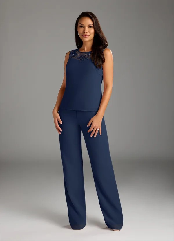
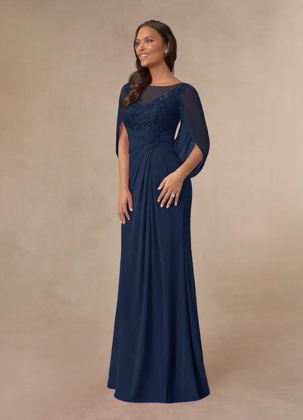
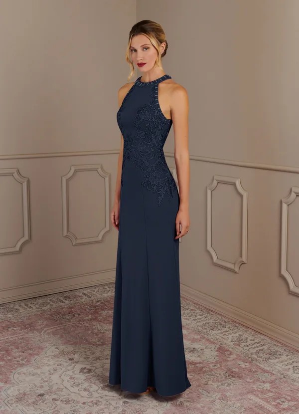
- Navy & Midnight: Classic, refined, timeless. Ideal for black-tie or formal evenings.
- Emerald & Deep Green: Grounded elegance; beautiful for winter, fall, or garden/vineyard settings.
- Sapphire & Royal Blue: Confident, photogenic, and universally flattering on camera.
- Plum & Aubergine: Sophisticated depth; gorgeous for cool undertones and evening light.
- Burgundy & Wine: Romantic, festive, and ideal for fall/winter celebrations.
- Champagne & Warm Neutrals: Understated, graceful—always ask the bride first if she’s in white/ivory.
- Soft Pastels (dusty rose, lavender, powder blue): Airy and romantic—great for garden or spring weddings.
- Pewter & Charcoal: Modern alternative to black; elegant for city lofts or contemporary art venues.
- Black (if permitted): Sleek and slimming; better for evening or city settings—confirm with the couple.
- Soft Prints & Florals: Can be perfect for garden parties and daytime weddings—choose refined patterns that read elegant, not casual.
Season & Venue: Choose a Color that Works There
Each setting shifts how color looks and feels. Use the couple’s venue and date to guide your palette.
Spring & Summer (daytime, garden, outdoor, or beach)
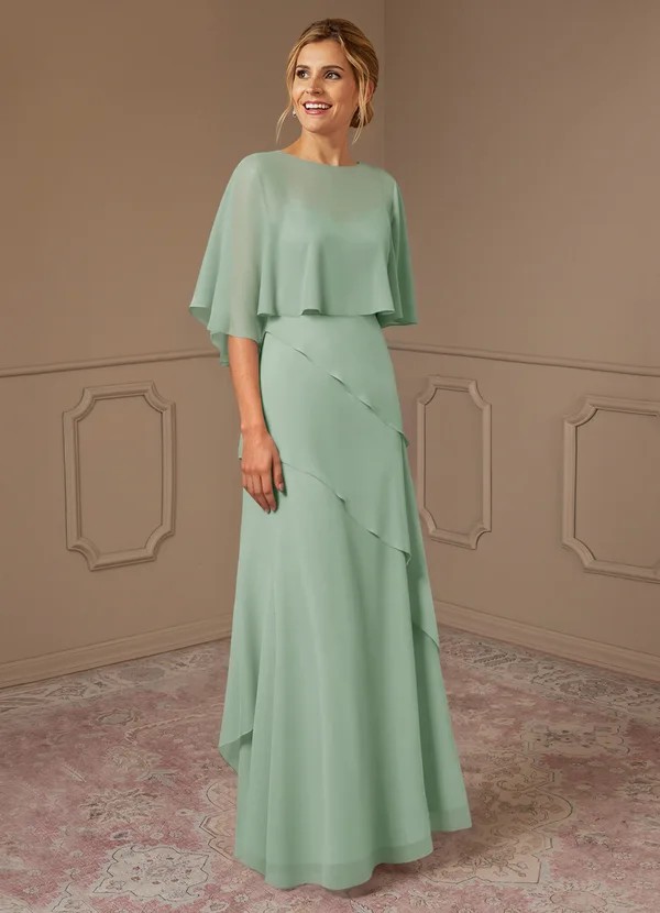
- Lean into: Dusty rose, blush, sage, mint, light blue, lilac; soft metallics like champagne or rose gold.
- Why: Pastels and airy tones glow in daylight and suit floral, garden, or coastal scenes.
- Note: If it’s very sunny, avoid super-shiny satin (can glare in photos). Opt for matte or satin-back crepe.
Fall (vineyard, rustic, harvest palettes)
- Lean into: Terracotta, cinnamon, burgundy, forest green, navy, plum; soft gold or antique metallics.
- Why: Warm, saturated hues echo autumn foliage and golden-hour lighting for rich photos.
- Note: Consider mid-weight fabrics (crepe, satin-back crepe) to enrich the tone.
Winter / Holiday (ballroom, cathedral, mountain)
- Lean into: Deep jewel tones (emerald, garnet, amethyst), navy, black, pewter, champagne.
- Why: Low light loves richer pigments; jewel tones and subtle shimmer feel celebratory and chic.
- Note: Add a velvet wrap or elegant sleeve for warmth; satin-back crepe and velvet photograph beautifully.
City / Modern Loft
- Lean into: Black, winter white* (with bride’s blessing), pewter, deep teal, merlot.
- Why: Sophisticated palettes suit sleek architecture; darker or cool neutrals read upscale on camera.
- Note: If choosing winter white, ask the bride directly. Differentiate with texture (e.g., ivory crepe + metallic jacket).
*White/ivory for mothers is only appropriate with the couple’s explicit approval. See Etiquette below.
Fabric Finish Changes the Color
The same color looks different on different textiles.
Consider how finish alters the hue—and if it fits the setting.
- Matte (crepe, georgette): Soft, diffused color—kind to texture and daylight.
- Satin-back crepe: Polished yet gentle sheen—ideal for late-afternoon/evening.
- High-gloss satin: Dramatic but can magnify curves and highlight creases in bright sun.
- Lace & Jacquard: Texture adds depth; mixed yarn colors (e.g., pewter threads on navy) can subtly echo the palette.
- Tulle & organza: Read lighter and more ethereal; great for overlays and capelets.
Dress Color + Skin Tone + Hair/Eye Color (Harmony Tips)
Your portrait area (face, hair, eyes) guides the best color choice.
Aim for a shade that brightens your complexion and complements your features.
- Fair skin + light hair/eyes (low contrast):
- Try: dusty rose, soft lavender, light teal, champagne, soft grey.
- Avoid: ultra-bright neon, stark black/white; they can overpower.
- Metal: silver, platinum, or soft rose gold.
- Medium/olive skin + dark hair (medium contrast):
- Try: emerald, teal, cobalt, berry, warm blush, pewter.
- Metal: gold or mixed metals depending on palette.
- Deep skin tones (low/high contrast):
- Try: jewel tones (sapphire, amethyst, ruby), bold corals, peacock, gold.
- Consider layered textures (velvet, satin-back crepe) for luxurious depth.
- Gray/silver hair:
- Try: navy, pewter, teal, soft blush, lavender; silver or pearl jewelry.
- Avoid: colors that match hair exactly—add contrast with deeper hues or metallic accents.
Etiquette: Coordinating Without Competing
Color choice is as much about connection as it is about fashion.
Keep the spotlight on the couple while honoring your role.
- Ask the bride about white/ivory/champagne.
Many couples prefer to keep true white/ivory for the bride alone.
• If you love pale tones, consider champagne, dove, blush, or soft gold—and always get her blessing. - Coordinate, don’t clone.
Echo the palette via tone or accessories, but avoid the bridesmaids’ exact fabric + color. - Respect the dress code and venue.
A black-tie palette suits deeper, formal shades; a daytime garden wedding calls for light, airy tones. - Sync with other VIPs.
Share swatches with the mother of the groom/partner. Plan complementary hues (e.g., champagne + sage, navy + pewter) for cohesive photos.
Color & Theme Matrix (Mother-Friendly Shortlist)
This table bridges color with common themes. Use it to spark your short list.
| Theme / Venue | MOB Color Staples | Notes |
| Black-Tie Ballroom | Navy, midnight, emerald, deep plum, champagne | If bride wears white/ivory, choose non-white or get her blessing |
| Garden / Spring | Dusty rose, sage, lavender, powder blue | Opt for chiffon/georgette; soft metallics |
| Vineyard / Autumn | Burgundy, cabernet, terracotta, forest green, soft gold | Mid-weight crepe or satin-back crepe photographs beautifully |
| Beach / Coastal | Ecru (ask first), seafoam, light periwinkle, sand | Breezy fabrics; minimal shine; no heavy black |
| Modern / City Loft | Black, pewter, winter white* (ask), deep teal | Sleek matte crepe; structured clutches; subtle sparkle |
| Mountain / Winter | Emerald, navy, wine, pewter, champagne | Velvet or mikado; sleeves or capelet for warmth |
*White/ivory only with explicit approval from the couple.
Practicalities: Lighting, Prints & Photography
- Test in real light.
Take photos and short video clips in daylight and indoor warm light—what you wear at 2 p.m. outside can look different at a 6 p.m. reception. - Consider print scale.
Smaller florals or tonal jacquards read elegant; huge high-contrast prints can dominate group photos. - Balance with accessories.
If your color is bold (emerald, royal blue), keep jewelry refined. If the dress is understated (pewter crepe), a statement cuff or pearl collar elevates the look. - Match metals to hue.
– Cool hues → silver/platinum
– Warm hues → gold/rose gold
– Mixed metals work with neutral palettes (champagne, taupe, pewter)
Special Considerations: Body Confidence & Color Placement
Color isn’t just which shade—it’s where you place it.
- Strategic color blocking:
Darker panels at the waist or sides subtly sculpt. A darker skirt with a lighter bodice keeps brightness near your face. - Print placement:
Florals concentrated at the neckline or sleeves draw attention upward (great for photos).
Avoid heavy prints across the midsection if you prefer a smoother line. - Sheer & overlays:
Lace or chiffon overlays in a lighter tone soften deeper base colors and can feel less heavy for daytime weddings.
Cultural & Family Traditions
Color carries meaning in many cultures.
Always confirm expectations early.
- White/ivory may be reserved for the bride in Western traditions.
- Red, gold, or specific hues may symbolize joy or heritage in South Asian, Chinese, or Middle Eastern weddings.
- Black can be formal or funereal depending on culture—ask if it’s welcome.
- Compromise with accents: If a specific color is meaningful (e.g., red), incorporate it in a shawl, belt, or jewelry if full garments aren’t appropriate.
Fabric Can Shift the Shade—Try Before You Buy
Even the “right” color can skew under different finishes and lights.
Bring or request swatches when possible.
- Compare side-by-side: Place swatches next to the bridesmaid color and your skin in natural light.
- Factor in fabric weight: A “slate blue” in chiffon may look softer than in satin—both can work, but the mood differs.
- Steam test: Creases catch light and alter how colors read; know how the fabric responds to steaming.
Practical Tips: Ordering, Swatches & Return Policies
- Order early so you can pivot on color if needed.
- Ask for fabric codes (e.g., “champagne satin-back crepe vs. champagne chiffon”) to ensure exact color matching across pieces.
- Confirm return policy before cutting tags—custom sizes or “final sale” colors are usually not returnable.
- Keep all tags/packaging intact until you’re 100% sure.
Outfit Formulas by Color Family (Copy & Customize)
Use these plug-and-play ideas to bring your chosen color to life.
Each formula includes jewelry, wrap, and shoe suggestions that harmonize with your hue.
- Navy (Black-Tie Classic)
- Dress: Floor-length crepe column or A-line with subtle beading.
- Accents: Silver or platinum jewelry; crystal drop earrings.
- Wrap/Shoes: Beaded bolero or satin shawl; closed-toe pumps with a low sheen.
- Emerald (Evening or Winter Garden)
- Dress: Satin-back crepe A-line with ¾ sleeves.
- Accents: Gold cuff + emerald or pearl studs.
- Wrap/Shoes: Velvet capelet; gold-toned pumps.
- Dusty Rose (Spring Garden)
- Dress: Chiffon tea-length with lace bodice and flutter sleeves.
- Accents: Pearl drop earrings; rose-gold bracelet.
- Shoes/Bag: Nude or champagne block heels; satin clutch.
- Pewter (Modern Loft)
- Dress: Stretch crepe midi with square neckline.
- Accents: Sleek silver cuff; diamond/clear crystal studs.
- Layer: Cropped crepe jacket; nonslip pumps.
- Champagne (Bride-Approved Neutral)
- Dress: Mikado sheath with waist seaming (train-free).
- Accents: Pearl collar or delicate gold chain; no veils.
- Note: Confirm color with the bride first; choose a slightly warmer or textured ivory to avoid “bridal twin.”
- Burgundy (Autumn/Winter)
- Dress: Crepe fit-and-flare with subtle shimmer trim.
- Accents: Gold statement earrings; berry clutch.
- Shoes: Block-heel pumps; consider a mini-sweep hem for polish.
- Sage / Eucalyptus (Outdoor Daytime)
- Dress: Georgette A-line with V-neck and sleeves.
- Accents: Mother-of-pearl earrings, gold or mixed metals.
- Shoes: Low wedges; heel protectors for lawn.
Color Decision Checklist (Print & Bring)
- Couple’s palette & color “no-go’s” confirmed (incl. white/ivory policy).
- Venue + time of day + dress code noted.
- Undertone identified (cool/warm/neutral) and contrast level (high/low) considered.
- 2–3 color families shortlisted (e.g., navy/emerald/pewter).
- Swatches or try-ons tested in daylight and warm indoor light.
- Fabric finish chosen (matte/crepe vs. satin vs. lace/jacquard).
- Metal pairing decided (gold/silver/rose gold/mixed).
- Coordination with mother of the groom/other VIPs confirmed.
- Two fittings scheduled; shoes & undergarments ready (color may shift with different nudes).
- Return policy checked; tags left on until final decision.
Do / Don’t (Color Edition)
Do
- Do begin with context + undertone before falling for a hue on the hanger.
- Do consider how the color reads in photos and lighting (day vs. evening).
- Do coordinate—not compete—with the bridal palette and the bride.
- Do use texture (lace/jacquard) to add interest without overpowering.
- Do keep one focal accessory and harmonize metals to your color.
Don’t
- Don’t wear true bridal white/ivory without the bride’s blessing.
- Don’t default to the same color as the bridesmaids; aim for complementary.
- Don’t pick a shade solely by name; always test the exact fabric in real light.
- Don’t ignore comfort—deep colors can run warm; pale shades show stains more readily (pack a cloth & mini stain stick).
Final Takeaway
The “perfect” mother-of-the-bride color is the one that respects the couple’s palette, enhances your natural coloring, and suits the venue and time of day—all while keeping you comfortable and confident. Start with the wedding’s story and your undertone, shortlist a few families, and
then test in real light and fabric.With the tables, tips, and checklists above, you’ll choose the right color for a mother of the bride dress—a hue that looks stunning in photos, harmonizes with the celebration, and feels authentically you.