How Do I Choose the Perfect Color for a Bridesmaid Dress?
Choose bridesmaid dresses colors based on your wedding season, venue style, and overall color palette. Order fabric swatches to see colors in person before making final decisions.Consider your bridesmaids’ skin tones when selecting colors. Navy, burgundy, dusty blue, and emerald green flatter all skin tones universally.
Match bridesmaid colors to 1–2 main colors from your wedding theme. Test colors in your venue lighting before ordering dresses.
Perfect Bridesmaid Color Selection Quick Guide
| Decision Factor | What to Consider | Best Practice | Impact Level | When to Decide |
| Wedding season | Spring, summer, fall, winter | Match seasonal palette | High | 6–8 months before |
| Venue style | Garden, beach, ballroom, barn | Complement venue aesthetic | High | 6–8 months before |
| Skin tones | Fair, medium, deep, olive | Choose universally flattering | Medium | 5–7 months before |
| Wedding palette | 2–4 coordinating colors | Use 1–2 colors for dresses | High | 6–8 months before |
| Photo backdrop | Indoor, outdoor, time of day | Test in actual lighting | Medium | 4–6 months before |
Understanding Color Psychology for Weddings
Colors create mood and emotion in wedding photos. Choose colors that match your wedding vision.
What Different Colors Communicate
Red and Burgundy:

Emotional Impact:
- Passionate and romantic
- Bold and confident
- Warm and inviting
- Classic and timeless
- Formal and elegant
- Dramatic in photos
Best For:
- Fall and winter weddings
- Evening formal events
- Ballroom receptions
- Classic romantic themes
- Intimate gatherings
- Bold, confident brides
Avoid If:
- Want soft, subtle aesthetic
- Beach or casual venue
- Spring garden wedding
- Very traditional bride
- Pastel color scheme
Blue (Navy, Dusty Blue, Royal):

Emotional Impact:
- Calm and serene
- Trustworthy and stable
- Sophisticated and elegant
- Versatile and timeless
- Cool and refreshing
- Universally flattering
Best For:
- All seasons work well
- Beach and coastal weddings
- Classic formal events
- Modern minimalist themes
- Mixed skin tone groups
- Conservative families
Avoid If:
- Want very warm color palette
- Rustic autumn theme
- All-pastel garden look
- Want bold, dramatic colors
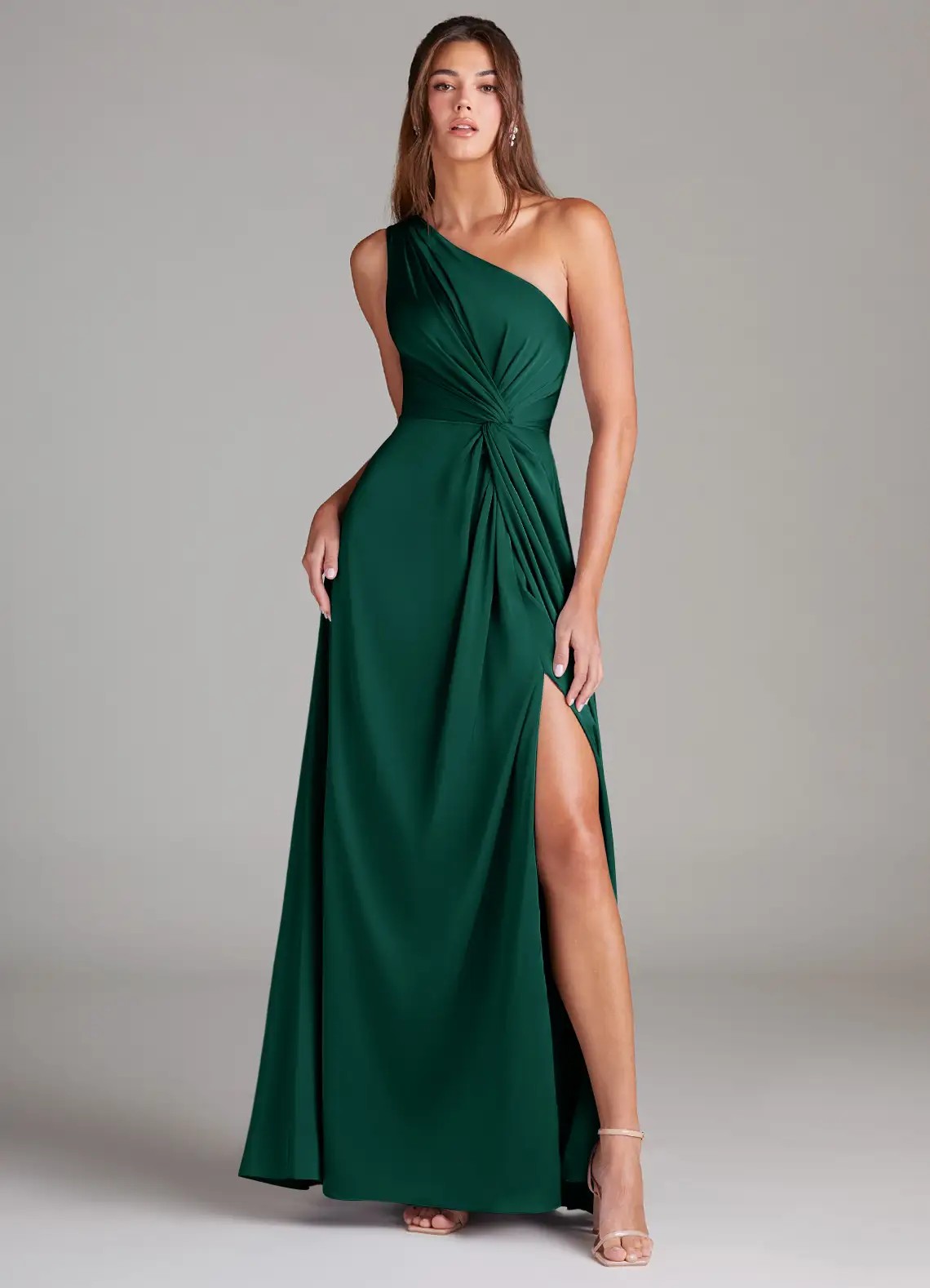
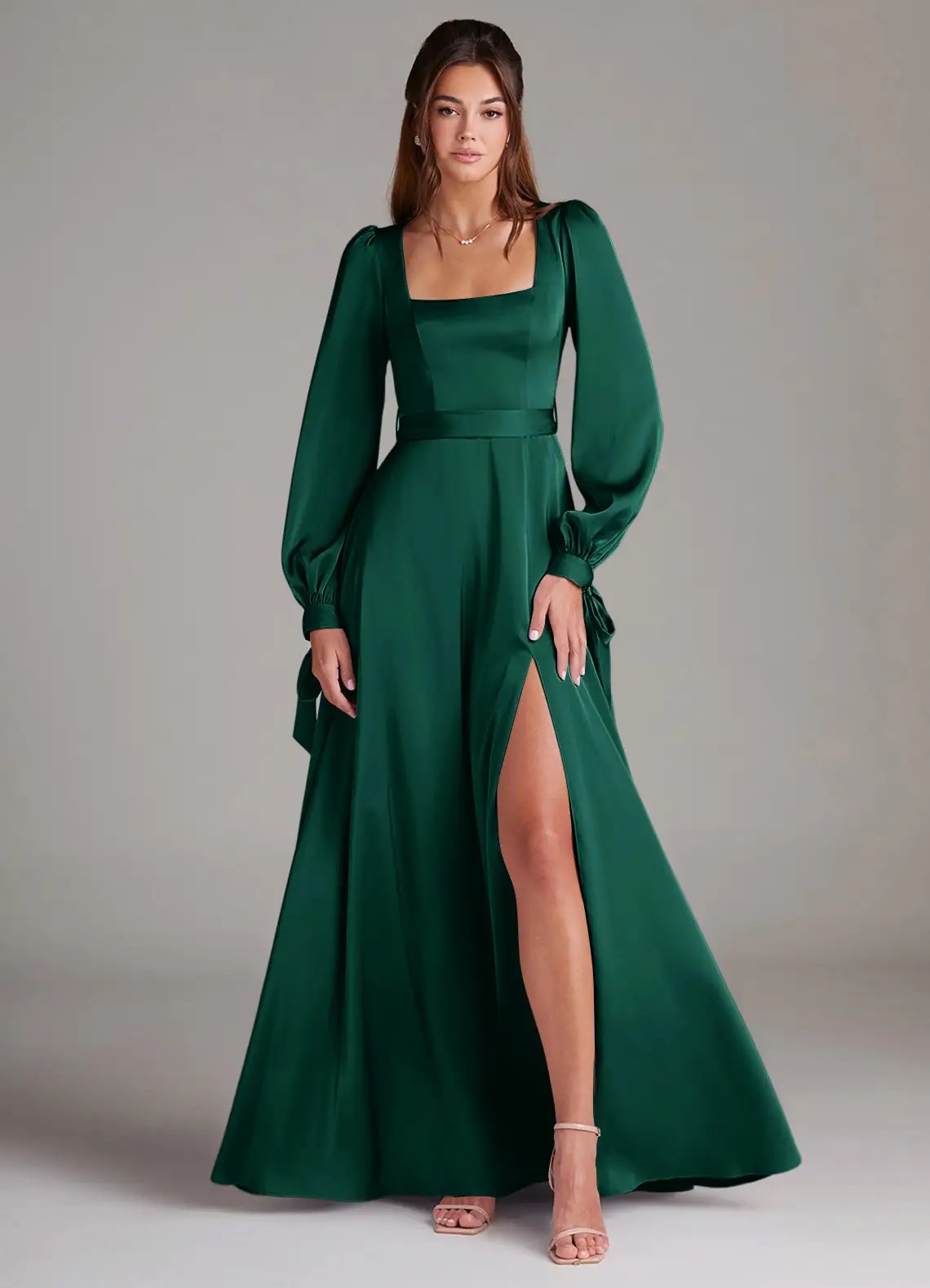
Green (Sage, Emerald, Olive):
Emotional Impact:
- Natural and organic
- Fresh and rejuvenating
- Balanced and harmonious
- Peaceful and calming
- Growth and renewal
- Earthy and grounded
Best For:
- Garden and outdoor weddings
- Spring and summer seasons
- Rustic barn venues
- Bohemian themes
- Eco-conscious couples
- Nature-inspired weddings
Avoid If:
- Very formal ballroom venue
- Winter holiday wedding
- Want classic traditional look
- Competing with greenery backdrop
Pink (Blush, Dusty Rose, Mauve):
Emotional Impact:
- Romantic and feminine
- Soft and gentle
- Sweet and delicate
- Youthful and playful
- Warm and loving
- Classic bridal
Best For:
- Spring and summer weddings
- Garden and outdoor venues
- Romantic classic themes
- Feminine aesthetic
- Daytime events
- Pastel color schemes
Avoid If:
- Want bold dramatic look
- Masculine or modern aesthetic
- Fall/winter dark palette
- Too traditional for your style
Purple (Lavender, Plum, Eggplant):
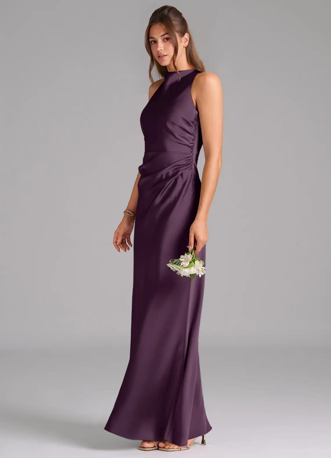
Emotional Impact:
- Luxurious and regal
- Creative and unique
- Mysterious and elegant
- Romantic and whimsical
- Sophisticated choice
- Less common option
Best For:
- Spring weddings (lavender)
- Fall/winter weddings (plum)
- Garden venues
- Romantic elegant themes
- Unique color preferences
- Evening events
Avoid If:
- Very traditional families
- Want safe classic colors
- Beach or coastal theme
- All-white minimalist look
Neutral (Champagne, Taupe, Gray):
Emotional Impact:
- Sophisticated and refined
- Timeless and elegant
- Versatile and safe
- Modern and chic
- Subtle and understated
- Professional appearance
Best For:
- All seasons and venues
- Modern minimalist weddings
- Mixed-style bridal parties
- When bridesmaids choose styles
- Formal elegant events
- Uncertain color decisions
Avoid If:
- Want vibrant colorful photos
- Garden with colorful flowers
- Need to stand out in photos
- Want traditional bridal look
Color Emotion and Usage Guide
| Color Family | Emotion/Mood | Best Season | Best Venue | Formality | Skin Tone Match |
| Red/Burgundy | Passionate, bold | Fall/Winter | Ballroom, indoor | Formal | Medium to deep |
| Navy | Sophisticated, calm | All seasons | All venues | Formal | All skin tones |
| Dusty Blue | Serene, romantic | Spring/Summer | Beach, garden | Semi-formal | All skin tones |
| Emerald | Luxurious, fresh | Fall/Winter | Garden, ballroom | Formal | All skin tones |
| Sage | Natural, peaceful | Spring/Summer | Garden, outdoor | Casual/Semi-formal | Fair to medium |
| Blush | Romantic, feminine | Spring/Summer | Garden, outdoor | Semi-formal | Fair to medium |
| Burgundy | Rich, elegant | Fall/Winter | Indoor, formal | Formal | Medium to deep |
How to Match Colors to Your Wedding Season
Each season has signature color palettes. Match your bridesmaid colors to seasonal aesthetics.
Spring Wedding Colors (March–May)
Signature Spring Palette:
Soft Pastels:
- Blush pink
- Lavender
- Mint green
- Baby blue
- Peach
- Soft yellow
Why These Colors Work:
- Reflect blooming flowers
- Light and fresh feeling
- Complement spring gardens
- Photograph beautifully in natural light
- Match season’s energy
- Align with spring weddings
Color Selection Strategy:
Single Color:
- All bridesmaids in dusty rose
- Creates cohesive spring look
- Romantic and feminine
- Easy to coordinate
- Safe traditional choice
Two-Color Mix:
- Half in blush, half in lavender
- Creates subtle contrast
- Still very cohesive
- Adds visual interest
- Modern approach
Ombre Gradient:
- Lightest blush to dusty rose to mauve
- Creates flowing effect
- Very spring-appropriate
- Instagram-worthy photos
- Trendy and artistic
Spring Color Combinations:
| Primary Color | Secondary Color | Accent Color | Best For | Avoid |
| Blush | Champagne | Gold | Garden weddings | Beach (too soft) |
| Lavender | Sage | Silver | Outdoor venues | Ballroom (too casual) |
| Dusty blue | Blush | Rose gold | All venues | Very rustic barn |
| Mint | Peach | Gold | Casual outdoor | Formal ballroom |
Summer Wedding Colors (June–August)
Signature Summer Palette:
Bright and Bold:
- Coral
- Turquoise
- Fuchsia
- Sunshine yellow
- Tropical orange
- Hot pink
Coastal and Calm:
- Dusty blue
- Seafoam green
- Aqua
- Sandy beige
- Soft teal
- Sky blue
Why These Colors Work:
- Energetic and vibrant
- Match outdoor settings
- Photograph well in bright sun
- Reflect summer’s warmth
- Work for beach or garden
- Complement summer florals
Color Selection Strategy:
Beach Wedding:
- Dusty blue or aqua
- Light and breezy
- Complements ocean
- Not too formal
- Photographs beautifully with water
Garden Wedding:
- Coral or peach
- Complements greenery
- Warm and inviting
- Not overwhelming
- Works with summer flowers
Formal Summer:
- Navy or emerald
- Sophisticated choice
- Works in heat
- Evening appropriate
- Timeless and elegant
Summer Color Combinations:
| Primary Color | Secondary Color | Accent Color | Best For | Avoid |
| Dusty blue | Champagne | Rose gold | Beach, coastal | Indoor winter |
| Coral | Mint | Gold | Tropical, outdoor | Formal ballroom |
| Navy | Blush | Gold | All venues | Very casual |
| Aqua | Ivory | Silver | Beach, poolside | Rustic barn |
Fall Wedding Colors (September–November)
Signature Fall Palette:
Jewel Tones:
- Burgundy
- Emerald green
- Plum purple
- Navy blue
- Deep teal
- Sapphire
Earth Tones:
- Terracotta
- Rust orange
- Olive green
- Chocolate brown
- Burnt sienna
- Mustard yellow
Why These Colors Work:
- Rich and saturated
- Match autumn leaves
- Warm and cozy feeling
- Photograph beautifully in fall light
- Work indoor and outdoor
- Complement fall florals
Color Selection Strategy:
Classic Fall:
- Burgundy or wine
- Most popular fall choice
- Rich and romantic
- Works all venues
- Photographs beautifully
Modern Fall:
- Rust or terracotta
- Trendy earth tone
- Rustic and warm
- Perfect for barn venues
- Instagram-worthy
Elegant Fall:
- Emerald or navy
- Sophisticated jewel tone
- Formal and timeless
- Works for evening
- Universally flattering
Fall Color Combinations:
| Primary Color | Secondary Color | Accent Color | Best For | Avoid |
| Burgundy | Navy | Gold | Formal, classic | Beach, casual |
| Emerald | Dusty rose | Gold | Romantic, rich | Very rustic |
| Rust | Olive | Champagne | Rustic, barn | Ballroom formal |
| Plum | Sage | Silver | Garden, elegant | Beach coastal |
Winter Wedding Colors (December–February)
Signature Winter Palette:
Classic Elegance:
- Navy blue
- Charcoal gray
- Black
- Wine/burgundy
- Forest green
- Silver
Winter Jewels:
- Emerald
- Sapphire
- Ruby red
- Amethyst
- Deep purple
- Icy blue
Why These Colors Work:
- Formal and sophisticated
- Match indoor venues
- Rich colors stand out
- Work with winter lighting
- Photograph beautifully indoors
- Complement holiday themes
Color Selection Strategy:
Holiday Wedding:
- Emerald or burgundy
- Classic Christmas colors
- Festive and elegant
- Works with holiday decor
- Timeless choice
New Year’s Wedding:
- Navy or charcoal with silver
- Sophisticated and modern
- Evening appropriate
- Formal and elegant
- Metallic accents work
Winter Romance:
- Burgundy or plum
- Rich and romantic
- Warm against cold
- Photographs beautifully
- Works all venues
Winter Color Combinations:
| Primary Color | Secondary Color | Accent Color | Best For | Avoid |
| Navy | Silver | Ivory | Formal, timeless | Outdoor rustic |
| Emerald | Gold | Champagne | Holiday, luxurious | Beach, casual |
| Burgundy | Champagne | Rose gold | Romantic, warm | Summer outdoor |
| Charcoal | Blush | Silver | Modern, sophisticated | Very traditional |
Matching Colors to Venue Type
Venue style significantly influences color selection. Choose colors that complement your venue’s aesthetic.
Indoor Formal Venues (Ballroom, Hotel)
Best Colors:
Rich Jewel Tones:
- Navy blue
- Burgundy
- Emerald green
- Plum purple
- Sapphire blue
- Deep teal
Why They Work:
- Sophisticated and elegant
- Match formal setting
- Photograph well with indoor lighting
- Suit structured venue
- Work for evening events
- Create dramatic impact
Styling Tips:
- Choose satin or velvet fabrics
- Floor-length formal styles
- Statement jewelry appropriate
- Elegant updos
- Metallic heels (gold, silver)
- Rich, saturated colors
Colors to Avoid:
- Very light pastels (washed out)
- Overly casual earth tones
- Too beachy or rustic shades
- Neon or bright colors
- Anything too informal
Outdoor Garden Venues
Best Colors:
Natural Soft Tones:
- Sage green
- Dusty rose
- Lavender
- Champagne
- Taupe
- Soft blush
Why They Work:
- Blend with natural surroundings
- Do not compete with flowers
- Complement greenery
- Photograph beautifully outdoors
- Work in natural light
- Feel organic and fresh
Styling Tips:
- Light flowing fabrics (chiffon)
- Natural makeup and hair
- Minimal jewelry
- Flower crowns optional
- Neutral or metallic shoes
- Soft romantic styling
Colors to Avoid:
- Neon or overly bright
- Pure white (competes with bride)
- Colors that blend into grass/trees
- Very dark heavy colors for daytime
Beach and Coastal Venues
Best Colors:
Ocean-Inspired Palette:
- Dusty blue
- Aqua
- Seafoam green
- Coral
- Sandy beige
- Soft turquoise
Why They Work:
- Reflect ocean and sky
- Light colors suit beach
- Photograph beautifully with water
- Complement sandy backdrop
- Feel breezy and relaxed
- Match coastal aesthetic
Styling Tips:
- Lightweight chiffon or mesh
- Shorter lengths prevent sand drag
- Barefoot or flat sandals
- Loose beachy hair
- Minimal accessories
- Relaxed styling
Colors to Avoid:
- Heavy dark colors
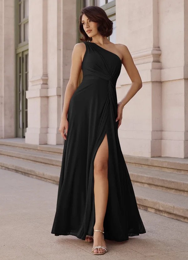
- Black (too formal)
- Thick fabrics
- Overly formal shades
- Heavy embellishments
Rustic Barn Venues
Best Colors:
Warm Earth Tones:
- Rust orange
- Olive green
- Terracotta
- Dusty blue
- Mauve
- Burnt sienna
Why They Work:
- Complement wood and natural elements
- Warm and cozy feeling
- Match rustic aesthetic
- Photograph well with barn backdrop
- Feel organic and natural
- Suit casual elegance
Styling Tips:
- Mix textures (lace, chiffon)
- Boots or rustic shoes acceptable
- Natural loose hairstyles
- Wood or leather accessories
- Burlap or lace accents
- Relaxed styling
Colors to Avoid:
- Overly formal jewel tones
- Very bright neon colors
- Too modern or sleek
- Pure black
- Stark white
Venue and Color Matching Guide
| Venue Type | Best Color Families | Fabric Suggestions | Styling Direction | Avoid | Season Flexibility |
| Ballroom | Jewel tones, navy, burgundy | Satin, velvet | Formal, structured | Casual pastels | All seasons |
| Garden | Earth tones, pastels, soft colors | Chiffon, tulle | Natural, romantic | Neon, pure white | Spring/Summer best |
| Beach | Blues, corals, neutrals | Light chiffon, mesh | Casual, breezy | Black, heavy colors | Summer/Early fall |
| Barn/Rustic | Rust, olive, dusty blue, mauve | Lace, chiffon | Natural, textured | Formal jewels, neon | Fall/Summer best |
| Modern/Industrial | Gray, mauve, taupe, black | Structured fabrics | Sleek, minimal | Traditional colors | All seasons |
Considering Bridesmaids’ Skin Tones
Choosing colors that flatter all skin tones ensures everyone looks beautiful in photos.
Universal Flattering Colors
Colors That Work for Everyone:
Navy Blue:
- Flatters all skin tones universally
- Cool undertones complement warm skin
- Deep color enhances fair skin
- Creates contrast on all tones
- Most versatile formal color
- Safe, classic choice
Burgundy/Wine:
- Rich color works universally
- Warm undertones flatter cool skin
- Deep saturation enhances fair skin
- Gorgeous on medium to deep skin
- Fall and winter appropriate
- Elegant and romantic
Emerald Green:
- Jewel tone complements everyone
- Cool green flatters warm undertones
- Rich color enhances all tones
- Beautiful on diverse skin
- Luxurious and elegant
- Works all seasons
Dusty Blue:
- Soft muted tone universally pretty
- Not too bright or pastel
- Flatters without overwhelming
- Works with all undertones
- Romantic and timeless
- Modern popular choice
Charcoal Gray:
- Neutral works with everything
- Sophisticated on all skin
- Not too dark or light
- Modern and elegant
- Safe versatile choice
- All seasons appropriate
Skin Tone-Specific Recommendations
Fair/Cool Skin Tones:
Most Flattering:
- Navy blue (creates contrast)
- Emerald green (pops beautifully)
- Dusty blue (soft contrast)
- Plum purple (rich depth)
- Burgundy (warm contrast)
Good Options:
- Forest green
- Royal blue
- Charcoal gray
- Deep teal
- Wine red
Avoid:
- Pale pastels (too similar)
- Light yellow (washes out)
- Orange (clashes)
- Beige (no contrast)
- Very light pink
Medium/Warm Skin Tones:
Most Flattering:
- Rust orange (warm harmony)
- Terracotta (earthy complement)
- Olive green (natural look)
- Burgundy (rich warmth)
- Coral (vibrant pop)
Good Options:
- Peach
- Champagne
- Gold metallics
- Warm reds
- Camel
Avoid:
- Overly bright neons
- Icy cool tones
- Very pale pastels
- Harsh black
- Electric blue
Deep/Rich Skin Tones:
Most Flattering:
- Jewel tones (emerald, sapphire)
- Bright vibrant colors
- Fuchsia (stunning pop)
- Gold metallics
- Royal blue
Good Options:
- Ruby red
- Deep purple
- Hot pink
- Turquoise
- Burnt orange
Avoid:
- Pale pastels (washed out)
- Beige (too similar)
- Light gray (no contrast)
- Pale yellow
- Champagne
Olive Skin Tones:
Most Flattering:
- Earth tones (rust, terracotta)
- Jewel tones (all)
- Burgundy (gorgeous)
- Navy (classic)
- Plum (elegant)
Good Options:
- Olive green
- Dusty rose
- Coral
- Teal
- Mauve
Avoid:
- Orange (clashes)
- Yellow-greens
- Mustard
- Gold (too similar)
- Lime green
Skin Tone and Color Matching Guide
| Skin Tone | Most Flattering | Good Options | Avoid | Why | Universal Backups |
| Fair/Cool | Navy, emerald, dusty blue | Forest green, burgundy | Pale pastels, yellow | Need contrast | Navy, dusty blue |
| Medium/Warm | Rust, terracotta, olive | Coral, champagne | Neon, icy tones | Warm harmony | Burgundy, emerald |
| Deep/Rich | Jewel tones, bright colors | Ruby red, hot pink | Pale pastels, beige | Need vibrant contrast | Navy, emerald |
| Olive | Earth tones, burgundy | Navy, plum, coral | Orange, yellow-green | Neutral undertones | Navy, burgundy |
Testing Colors Before Committing
Always test colors before ordering full dresses. This prevents expensive mistakes.
Ordering Fabric Swatches
Why Swatches Are Essential:
- Colors look different online vs real life
- Computer screens vary widely
- Lighting affects color perception
- Swatches show actual fabric color
- See colors together physically
How to Order:
What to Order:
- 3–5 top color choices
- Include neutrals for comparison
- Order complementary colors
- Get accent colors too
- Small investment prevents big mistakes
Arrival Time:
- Ships in 5–10 business days
- Plan ahead for timeline
- Order 6–8 months before wedding
- Gives time for decisions
- Allows for reordering if needed
Testing Process:
Step 1: View in natural daylight
- Hold swatches near window
- Midday light most accurate
- See true color without tint
- Morning and evening light differ
- Natural light = photo light
Step 2: View in venue lighting
- Bring swatches to venue if possible
- Test in ceremony space
- Check reception lighting
- Indoor vs outdoor difference
- Time of day matters
Step 3: Compare with wedding elements
- Hold next to flower samples
- Compare to venue decor colors
- Match with invitation colors
- See with table linens
- Check against other wedding colors
Step 4: Get opinions
- Show bridesmaids the swatches
- Ask trusted family/friends
- Consider photographer’s input
- Wedding planner advice
- Make group decision
Step 5: Test with skin tones
- Hold swatches near bridesmaids’ faces
- See which colors flatter most
- Consider range of skin tones
- Make sure everyone looks good
- Universal flattering most important
Color Testing Checklist
Questions to Ask:
- Does this color match my season?
- Does it complement my venue?
- Does it flatter all bridesmaids?
- Does it photograph well?
- Does it match my wedding palette?
- Does it work in venue lighting?
- Does it complement my flowers?
- Am I happy with this long-term?
Red Flags:
- Color looks completely different than online
- Does not match venue at all
- Washes out multiple bridesmaids
- Clashes with flowers or decor
- Too trendy (will date photos)
- Partner strongly dislikes it
- Bridesmaids all dislike it
Virtual Color Testing
If You Cannot Visit Venue:
Request Photos:
- Ask venue for ceremony space photos
- Get reception room images
- Ask for lighting information
- Request time-of-day photos
- See different lighting conditions
Digital Tools:
- Use color matching apps
- Try virtual wedding planners
- Upload venue photos and test colors
- See color combinations digitally
- Not perfect but helpful
Video Calls:
- FaceTime/Zoom with venue coordinator
- Show swatches on video
- Get real-time feedback
- See how colors look in space
- Better than nothing
Color Testing Timeline and Process
| Testing Stage | When to Do | What to Test | Decision Point | Time Needed |
| Order swatches | 6–8 months before | 3–5 color options | Narrow to 2–3 | 10 days shipping |
| Natural light test | After swatches arrive | True color accuracy | Eliminate wrong colors | 30 minutes |
| Venue lighting test | 5–7 months before | How colors look in space | Final 2 colors | 1–2 hours |
| Bridesmaid test | 5–6 months before | Skin tone compatibility | Final decision | 1 hour |
| Photographer input | 5 months before | Photo-readiness | Confirm choice | 30 minutes |
Common Color Selection Mistakes
Avoid these common errors when choosing bridesmaid dresses colors.
Mistake 1: Choosing Colors You See Online Only
The Problem:
- Online photos are not accurate
- Screens show different colors
- Lighting in photos varies
- No physical reference
- Order wrong color
The Solution:
- Always order fabric swatches first
- See physical color samples
- Test in your venue lighting
- Compare with wedding elements
Mistake 2: Ignoring Your Venue’s Existing Colors
The Problem:
- Venue has permanent decor (carpet, walls)
- Your color clashes badly
- Cannot change venue features
- Photos look uncoordinated
- Dresses compete with space
The Solution:
- Visit venue before choosing colors
- Note permanent color elements
- Choose complementary colors
- Bring swatches to venue
- Test colors in actual space
Mistake 3: Following Trends Instead of Personal Style
The Problem:
- Choose trendy color you do not love
- Photos date quickly
- Regret choice years later
- Does not reflect your style
- Social media pressure
The Solution:
- Choose colors you genuinely love
- Timeless colors age better
- Your wedding, your choice
- Consider long-term photo satisfaction
- Navy, burgundy, emerald are timeless
Mistake 4: Not Considering All Bridesmaids’ Skin Tones
The Problem:
- Choose color for one bridesmaid
- Washes out or clashes with others
- Some bridesmaids uncomfortable
- Uneven appearance in photos
- Hurt feelings possible
The Solution:
- Test colors with all bridesmaids
- Choose universally flattering colors
- Navy, burgundy, emerald work for all
- Consider diverse group
- Everyone should feel beautiful
Mistake 5: Matching Flowers Exactly
The Problem:
- Dresses exact same color as flowers
- Creates monotone appearance
- No depth or contrast
- Dresses blend into bouquets
- Flat photos
The Solution:
- Complement flowers, do not match
- Choose dress 1–2 shades different
- Creates visual interest
- Flowers pop against dresses
- More sophisticated look
Mistake 6: Choosing Too Many Colors
The Problem:
- Want rainbow effect
- Order 6+ different colors
- Looks chaotic in photos
- No cohesion
- Overwhelms wedding aesthetic
The Solution:
- Limit to 2–3 colors maximum
- Ombre uses 3–5 shades of one color
- Mix-and-match uses 2 complementary colors
- More than 3 looks uncoordinated
- Simple is more elegant
Mistake 7: Forgetting About Photo Backgrounds
The Problem:
- Choose green dresses for garden wedding
- Bridesmaids disappear into trees
- No contrast in outdoor photos
- Cannot see dresses clearly
- Wasted beautiful dresses
The Solution:
- Consider photo backdrop
- Green venue = dusty blue or coral dresses
- Beach = not sand/beige dresses
- Create contrast with surroundings
- Think about ceremony and reception photos
Frequently Asked Questions
What is the most popular bridesmaid dress color?
Navy blue is the most popular bridesmaid dress color. It flatters all skin tones, works for any season, and suits both formal and casual venues.
Dusty blue and burgundy are also very popular. These colors photograph beautifully and work with most wedding themes.
What colors look best in wedding photos?
Rich, saturated colors photograph best. Navy, burgundy, emerald, and dusty blue all look beautiful in wedding photos.
Avoid pale pastels that wash out and neon colors that overpower. Test colors in your venue lighting before ordering.
Should bridesmaid dresses match the wedding flowers?
No, bridesmaid dresses should complement flowers, not match exactly. Choose dresses 1–2 shades different from flower colors.
Exact matching creates a flat, monotone look. Complementary colors create depth and make flowers stand out.
Can bridesmaids wear different colors?
Yes, bridesmaids can wear different colors from your wedding palette. Keep colors within the same family or choose complementary colors.
Limit to 2–3 different colors maximum. More colors look chaotic. Test colors together with fabric swatches first.
What color is best for all skin tones?
Navy blue flatters all skin tones universally. Burgundy, emerald green, and dusty blue also work well for diverse bridal parties.
Avoid pale pastels with deep skin tones and avoid orange with fair skin. Choose colors that create contrast.
When should I decide on bridesmaid dress colors?
Decide on colors 6–8 months before your wedding. This gives time to order swatches, test in venue, and order dresses.
Order dresses 3–4 months before the wedding. This allows time for delivery (6–8 weeks) and alterations (2–3 weeks).
Final Tips for Choosing Perfect Bridesmaid Colors
Consider your wedding season first. Spring uses pastels, fall uses jewel tones and earth tones. Match colors to your venue aesthetic. Ballrooms suit jewel tones, gardens suit earth tones. Choose colors that flatter all bridesmaid dresses. Navy, burgundy, and emerald work universally.
Test colors in your venue lighting. Natural light, indoor lights, and flash affect colors differently. Complement flowers, do not match exactly. Choose dresses 1–2 shades different for depth.
Choose timeless over trendy colors. Classic colors like navy and burgundy age better in photos. Get opinions from bridesmaids and photographers. They provide valuable perspectives.