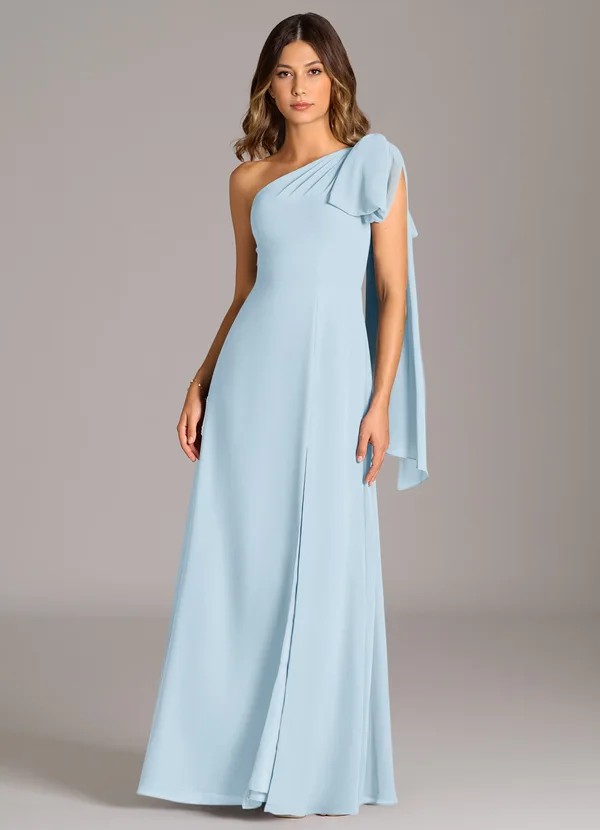
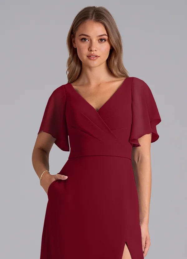
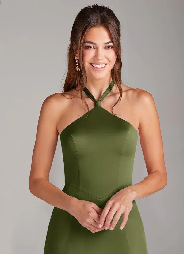
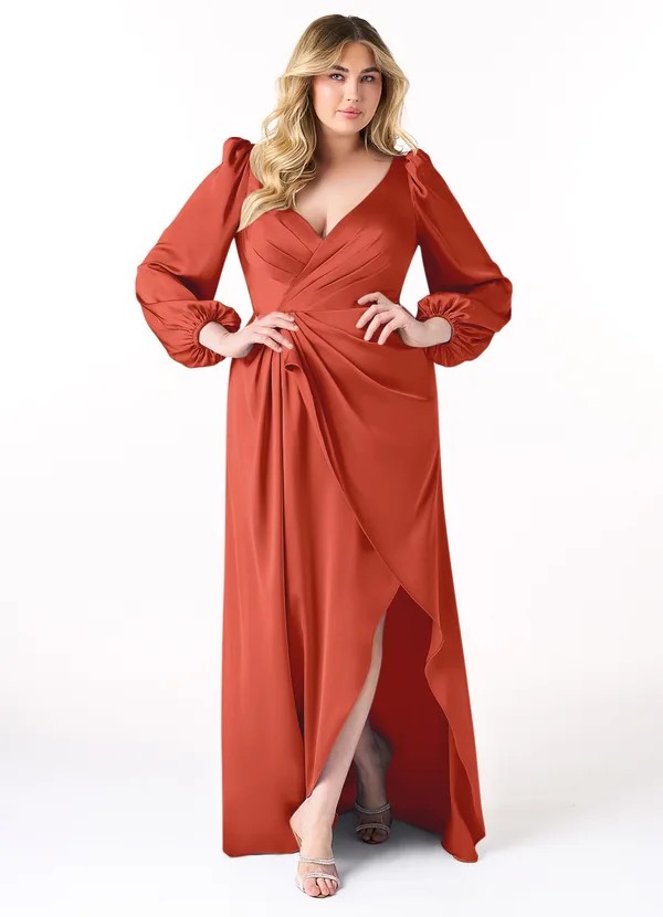
Can I Mix and Match Bridesmaid Dresses in Different Colors
The answer is absolutely yes — and it’s one of the most elegant trends in modern weddings. Gone are the days when every bridesmaid dresses had to wear the exact same color, cut, and fabric. Today, brides are embracing mix-and-match color palettes to create a more natural, inclusive, and personalized look that flatters every member of the bridal party.
To keep the look cohesive, choose one unifying element — such as a color family, fabric type, or tone range — and limit the palette to three or four shades that complement your wedding theme. Balance light and dark tones evenly across the lineup and consider each bridesmaid’s skin tone and body shape.
The result is a stylish, modern bridal party that feels coordinated yet beautifully individual.
Quick Overview Table
| Mix & Match Strategy | What to Keep Consistent | What Can Vary | Why It Works |
| Same Color Family | Fabric & tone warmth | Shade intensity (light/dark) | Creates depth and dimension |
| Tonal Gradient | One color in multiple tints | From blush → rose → wine | Looks harmonious in photos |
| Complementary Palette | Fabric texture | Neighboring hues (sage + champagne) | Adds visual interest |
| Pastel or Neutral Group | Dress length | Different light tones | Timeless, airy aesthetic |
| Seasonal Theme | Fabric & accessories | Colors inspired by the season | Matches overall wedding style |
Why Mixing Bridesmaid Dress Colors Works Beautifully

The mix-and-match trend celebrates individuality while maintaining harmony. It reflects the reality that no two bridesmaids are identical — in body type, skin tone, or personal style.
Here’s why it’s become a favorite among brides:
- Inclusivity: Allows everyone to choose a color that flatters them best.
- Visual Texture: Different hues create visual depth in photos.
- Creativity: Lets brides express personal aesthetics and wedding themes.
- Flexibility: Easy to accommodate last-minute size or color changes.
- Reusability: Bridesmaids are more likely to wear the dress again.
When executed with intention, mixed colors look elevated, effortless, and editorial.
Choose a Cohesive Color Story
Every mix-and-match bridal look begins with a color story — the visual thread that ties all dresses together.
A good color story has three key components:
- Base Color: The anchor shade that defines your palette.
- Accent Colors: Secondary tones that complement the base.
- Depth Variation: A balance of light, mid, and dark hues for dimension.
Pro Tip:
Aim for 3–4 total colors to maintain balance. More than that can appear disorganized in photos.
Popular Color Story Ideas
| Theme | Palette Example | Mood / Season |
| Romantic Neutrals | Champagne, taupe, sand, ivory | Spring / Summer |
| Dusty Pastels | Sage, blush, mauve, mist blue | Spring Garden |
| Earthy Warm Tones | Terracotta, rust, copper, beige | Autumn |
| Classic Blues | Dusty blue, slate, navy | Year-round elegance |
| Moody Jewel Tones | Emerald, wine, plum, navy | Fall / Winter |
| Soft Greens & Creams | Olive, eucalyptus, cream | Outdoor / Nature weddings |
Decide What Will Stay Consistent
To prevent the look from feeling random, keep at least one major element the same across all dresses.
You can choose consistency in:
- Fabric Type: All chiffon, satin, or crepe creates a unified texture.
- Dress Length: Full-length or midi dresses ensure symmetry.
- Neckline Family: For example, all soft V-necks or similar sleeves.
- Color Temperature: Warm or cool undertones across the palette.
This ensures the group looks curated — not chaotic.
Limit the Number of Shades

While variety is exciting, too many colors can overwhelm the overall look.
General rule:
- 2–3 colors for small bridal parties (3–5 bridesmaids).
- 3–4 colors for larger groups (6+ bridesmaids).
Example:
A fall wedding might use terracotta, champagne, and rust — all within the same warm family.
Use Fabric to Tie Everything Together
Even when colors differ, consistent fabric texture keeps the visual flow smooth.
Best Fabric Choices for Mixing Colors:
- Chiffon: Soft, matte, and airy; perfect for pastel or romantic palettes.
- Satin: Sleek and light-reflective; ideal for formal and jewel-toned looks.
- Velvet: Rich and elegant for winter weddings.
- Crepe: Clean and structured for minimal, modern styles.
Avoid mixing drastically different finishes (like shiny satin with matte chiffon) unless intentionally styled for contrast.
Coordinate Through Tone and Depth
Mixing colors works best when the tones share similar depth or saturation.
Here’s how to balance them:
- Pair light tones (champagne, blush) with medium tones (rose, mauve).
- Avoid extremes (super pale with super dark) in the same lineup.
- Stick to either warm-based or cool-based colors for harmony.
Tip: Create your palette digitally first — test colors side by side under natural and indoor light.
Balance the Lineup for Photos
In photos, placement of colors matters.
Photo Composition Tips
- Alternate light and dark dresses for visual rhythm.
- Position similar shades diagonally for even distribution.
- Place the bride in the center, flanked by complementary tones.
- Coordinate bouquets to balance color across the group.
Example:
If using blush, mauve, and wine, alternate them across the lineup to avoid clustering similar tones.
Match Accessories Across the Group
Accessories unify mixed colors instantly.
- Shoes: Choose one tone (like nude, gold, or silver).
- Jewelry: Match metal tone (all gold or all silver).
- Bouquets: Use similar floral palettes to connect the colors visually.
- Wraps or shawls: For cold-weather weddings, pick one shared texture or color.
Uniform accessories create polished harmony while letting each dress stand out.
Mix Colors by Theme or Season
Spring
-
- Palette: Sage, blush, dusty lavender, light sky.
- Fabrics: Chiffon or tulle for airy flow.
- Accent: Soft pastels and florals.
Summer
- Palette: Coral, dusty blue, buttercream, peach.
- Fabrics: Lightweight satin or crepe.
- Accent: Bright bouquets for contrast.
Autumn
- Palette: Rust, cinnamon, champagne, mocha.
- Fabrics: Satin, crepe, or velvet.
- Accent: Gold-toned jewelry and warm florals.
Winter
- Palette: Emerald, navy, burgundy, steel gray.
- Fabrics: Velvet, charmeuse, or heavy satin.
- Accent: Deep florals and metallic shoes.
Tip: Let nature guide your palette — seasonal colors always photograph beautifully outdoors.
Consider Skin Tone Harmony
Different shades flatter different skin undertones.
Warm Skin Tones:
Look great in gold, rust, peach, olive, or champagne.
Cool Skin Tones:
Shine in dusty blue, lavender, mauve, and emerald.
Neutral Skin Tones:
Can wear both families — muted mid-tones like rose or taupe work best.
Group Strategy:
Choose a palette that includes both warm and cool tones so each bridesmaid feels radiant in her dress.
Use the Bride’s Dress as a Style Anchor
Your bridal gown sets the tone for the entire wedding party.
- If the bride wears white or ivory: Use contrast through rich or pastel tones.
- If the bride wears champagne or blush: Match the palette with warm neutral dresses.
- If the gown is embellished: Keep bridesmaid fabrics minimal to balance detail.
Your gown becomes the focal point while mixed tones surround it gracefully.
Match or Contrast Groomsmen Attire

Cohesion extends to the other side of the aisle too.
- If bridesmaid dresses are multi-colored, use neutral groomsmen suits (gray, black, or beige).
- Coordinate ties or pocket squares to echo bridesmaid tones subtly.
- For pastel bridesmaids, pair with classic navy suits for contrast.
- For moody hues, use dark suits or tuxedos with accent accessories.
Visual Guide: Sample Color Pairings
| Color Theme | Sample Shades | Mood |
| Soft Romance | Blush, rose, champagne | Timeless & feminine |
| Modern Neutrals | Taupe, mocha, ivory | Understated elegance |
| Desert Sunset | Terracotta, clay, copper | Warm & trendy |
| Ocean Mist | Sage, seafoam, dusty blue | Fresh & natural |
| Evening Jewel | Emerald, navy, plum | Luxurious & bold |
| Citrus Garden | Buttercream, peach, coral | Bright & joyful |
Communicate With Your Bridesmaids
Keep your bridal party comfortable and confident through open communication.
- Share your color vision and allow input.
- Send fabric swatches or inspiration photos.
- Discuss flattering silhouettes for each person’s comfort.
- Give clear guidance: “Choose any dress in chiffon within these three shades.”
This ensures variety within boundaries — the sweet spot of modern coordination.
Do a “Color Rehearsal” Before Finalizing
Before final orders:
- Request color swatches from your vendor.
- Line them up side-by-side in natural light.
- Take photos to see how they photograph together.
- Adjust balance (remove a clashing hue or duplicate tone).
Tip:
Azazie’s sample swatch kits are a smart way to test combinations before committing.
Maintain a Unified Mood Across All Dresses
Color isn’t the only factor that creates unity — the vibe matters too.
Examples:
- Romantic theme: Soft fabrics, flowing silhouettes, pastel tones.
- Modern theme: Clean lines, structured fits, neutral colors.
- Vintage theme: Lace accents, muted hues, retro silhouettes.
- Boho theme: Mix of textures (chiffon + satin) in earthy tones.
Choose a tone that reflects your personality as a couple, and let colors complement that mood.
Common Mistakes to Avoid
Mixing too many textures — keep one primary fabric.
Choosing clashing undertones — warm and cool don’t always blend well.
Ignoring lighting conditions — colors may appear different indoors vs. outdoors.
Skipping color balance — cluster of similar tones looks uneven in photos.
Overcomplicating the palette — stick to simplicity; fewer colors create stronger visual unity.
Bonus: How to Photograph Mixed Palettes Beautifully
- Shoot in soft daylight for natural color rendering.
- Alternate shades for symmetry in group shots.
- Keep bouquets uniform to neutralize color variation.
- Coordinate bridesmaid dresses by tone gradient (lightest to darkest from left to right).
- Include the bride in white or ivory as the center anchor.
Tip: Always do a quick lineup test before the ceremony for color balance in photos.
Bridesmaid Coordination Checklist
- Choose 3–4 harmonious shades within one color family.
- Keep fabric and length consistent.
- Maintain balanced tone distribution (light, medium, dark).
- Match accessories like shoes and jewelry.
- Use the bride’s gown as a visual anchor.
- Confirm colors under natural and indoor lighting.
- Plan group photos with color placement in mind.
Frequently Asked Questions
Can I mix bridesmaid dress colors and fabrics?
Yes, but do it intentionally. Stick to one or two fabrics (e.g., chiffon and satin) that reflect similar sheen. Too many textures can make the group look disjointed.
How many colors are too many?
Aim for three to four complementary shades maximum. More than that can feel chaotic, especially in group photos.
Do bridesmaids have to choose from the same designer?
Not necessarily, but ordering from the same retailer ensures consistent fabric dye lots and color matching.
How can I make sure the dresses look cohesive in photos?
Keep a consistent fabric, length, and color tone. Balance the lineup by alternating lighter and darker hues.
What colors mix best for timeless looks?
Neutral families (champagne, taupe, blush) and dusty tones (sage, mauve, slate) never go out of style.
Should I match dress colors to wedding décor?
Yes, coordinate them. Use your floral palette or table settings as reference points for harmony.
