Blush vs. Hot Pink: Which Pink Wedding Guest Dresses Are Appropriate?
Both blush and hot pink can work as wedding guest colors, but context matters significantly. Blush requires careful consideration to avoid looking too close to white, while hot pink suits certain venues and dress codes better than others. The safest approach involves choosing medium-toned pinks that clearly read as color rather than neutral, ensuring you respect wedding etiquette while expressing personal style.
Understanding the Pink Spectrum
Pink encompasses an enormous range from barely-there blush to vibrant fuchsia. Wedding appropriateness depends on where your dress falls on this spectrum.
The Pink Categories:
| Pink Type | Description | Wedding Suitability | Risk Level |
| Pale blush | Barely pink, cream undertones | High risk in bright lighting | Potentially problematic |
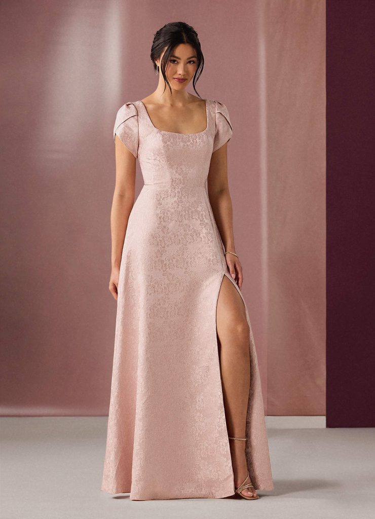
| Soft blush | Clearly pink but muted | Generally safe | Low risk |
| Rose/mauve | Pink with purple or brown tones | Always appropriate | Very safe |
| Coral pink | Pink with orange undertones | Excellent for warm seasons | Safe |
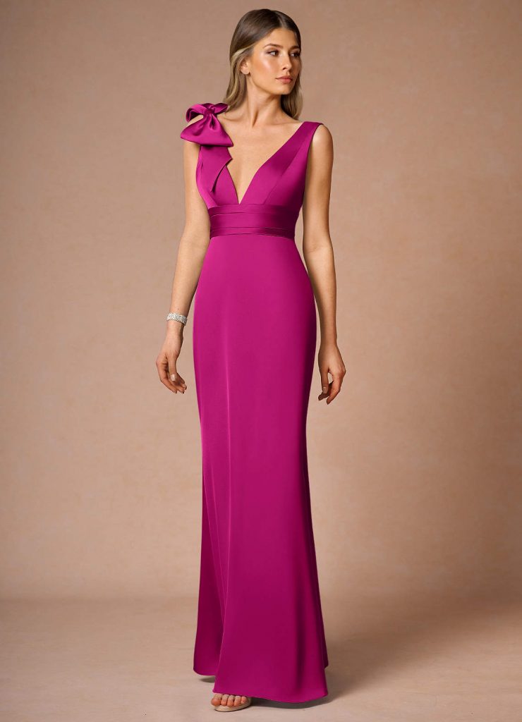
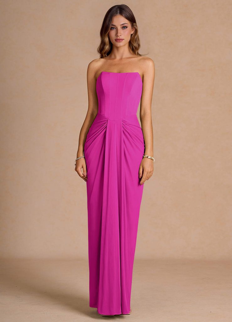
| Hot pink | Vibrant, saturated pink | Venue and dress code dependent | Medium risk |
| Fuchsia | Blue-toned bright pink | Formal events, evening | Medium risk |
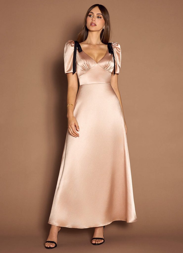
The Blush Pink Challenge
Blush pink’s popularity creates a genuine dilemma for wedding guests. This soft, romantic shade can look stunning but carries real risks.
When Blush Works:
Blush pink succeeds when it clearly reads as color rather than neutral. Consider these factors:
- Indoor evening receptions: Dim lighting makes blush appear more saturated
- Fabric matters significantly: Satin wedding guest dress in blush shows more color than matte fabrics
- Undertones create distinction: Peach-toned or rose-toned blush reads as clearly pink
- Pattern provides safety: Floral prints incorporating blush avoid the white-adjacent concern
When to Avoid Blush:
Certain situations make blush pink genuinely risky:
- Outdoor daytime ceremonies with bright natural light
- Beach or destination weddings where sun exposure washes out color
- Weddings with champagne, ivory, or blush bridal parties
- Any situation where you’re unsure of the bride’s dress color
The “white-adjacent” problem isn’t just etiquette paranoia. Photography washes out pale colors, and what looks clearly pink to your eye can photograph as off-white. If you’re questioning whether your blush dress might look too light, trust that instinct and choose something with more visible color.
Safe Blush Alternatives:
If you love soft pink but worry about appropriateness, these options eliminate risk:
- Dusty rose with visible mauve undertones
- Vintage rose with deeper saturation
- Coral blush with warm peachy tones
- Rose gold pink with metallic elements
For spring celebrations, spring wedding guest dress options in these deeper blush tones maintain the soft romantic aesthetic without white-adjacent concerns.
Seasonal Pink Considerations
Season affects which pink shades feel most appropriate and comfortable.
Spring Pink Guidelines:
Spring naturally suits pink tones. Lighter options work beautifully:
- Soft blush with floral undertones
- Cherry blossom pink
- Peachy coral pink
- Rose quartz shades
Garden and outdoor spring venues particularly suit these softer pink wedding guest dress options that complement blooming florals.
Summer Pink Choices:
Summer accommodates the full pink spectrum:
- Bright coral pink for beach venues
- Hot pink for evening celebrations
- Watermelon pink for daytime events
- Fuchsia for cocktail receptions
For formal summer events, explore wedding guest dresses summer formal in saturated pink tones that maintain elegance while embracing seasonal vibrancy.
Fall and Winter Pinks:
Cooler months call for different pink approaches:
- Dusty rose with gray undertones
- Mauve pink with purple notes
- Deep rose pink bordering burgundy
- Muted blush with brown undertones
Dress Code Implications
Wedding formality dramatically impacts pink appropriateness.
Casual and Daytime Weddings:
Relaxed dress codes offer maximum pink flexibility:
- Nearly any pink shade works appropriately
- Shorter lengths in hot pink feel perfectly suitable
- Printed dresses with multiple pink tones
- Playful styles and casual fabrics
Cocktail and Semi-Formal Events:
This middle-ground formality accommodates both ends of the pink spectrum:
- Midi wedding guest dress styles in any pink shade
- A-line silhouettes in hot pink or soft blush
- Structured fabrics in vibrant tones
- Elegant details balancing bold color
Formal and Black-Tie Weddings:
Maximum formality requires thoughtful pink selection:
- Deeper, more saturated pinks over pale blush
- Floor-length gowns in luxurious fabrics
- Classic silhouettes in bold colors
- Sophisticated styling regardless of pink intensity
Fabric and Style Considerations
How your pink dress is constructed affects its appropriateness as much as the shade itself.
Fabrics That Enhance Pink:
- Satin: Adds sheen that makes pink appear more saturated
- Chiffon: Creates romantic movement in flowing pink
- Velvet: Deepens any pink shade with rich texture
- Silk: Provides luxury appropriate for formal pinks
Fabrics That Complicate Pink:
- Thin cotton: Can look overly casual in bright pink
- Jersey: May appear too simple for formal weddings
- Sheer organza: Might wash out pale blush even further
Silhouette Impacts:
Style choices affect whether pink feels appropriate:
- A line wedding guest dresses: Classic silhouettes balance bold pink
- Structured bodices: Add formality to bright pink choices
- Flowing maxi styles: Soften hot pink with romantic movement
- Strapless wedding guest dress: Evening elegance suits saturated pinks
Photography Considerations
Modern wedding culture means every guest appears in numerous photos. Pink behaves uniquely in photographs.
How Different Pinks Photograph:
- Very pale blush can wash out completely or appear white
- Soft blush with warm undertones maintains visible color
- Medium pinks photograph accurately in most lighting
- Hot pink and fuchsia remain vibrant in photos
- Coral pink adds warmth to group photographs
Lighting Variables:
- Natural outdoor light: Washes out pale colors significantly
- Indoor reception lighting: Deepens and saturates pink tones
- Flash photography: Can lighten blush unexpectedly
- Golden hour: Enhances warm-toned pinks beautifully
Accessory Coordination
Pink provides versatile accessory options regardless of shade intensity.
Metallic Pairings:
| Pink Type | Best Metallics | Why It Works |
| Blush pink | Rose gold, yellow gold | Warm metals enhance soft tones |
| Hot pink | Silver, white gold | Cool metals balance vibrancy |
| Coral pink | Bronze, antique gold | Warm metals complement peachy undertones |
| Fuchsia | Silver, gunmetal | Cool metals suit blue-toned pink |
Neutral Accessories:
Both blush and hot pink work beautifully with neutral shoes and bags:
- Nude heels elongate legs with any pink shade
- Taupe or tan accessories ground bright pink
- White bags work exclusively with clearly saturated pink
- Black accessories add sophistication to hot pink
Avoid matching pink accessories exactly to your dress. This creates an overwhelming effect that feels costume-like rather than stylish.
Size Range Considerations
Pink flatters various body types when chosen thoughtfully. Azazie offers plus size wedding guest dresses in extensive pink options across the spectrum.
Shade Selection by Body Type:
- Darker pinks create natural definition
- Medium-toned pinks suit most figures universally
- Very pale blush may require strategic styling
- Hot pink works confidently on all body types
The extensive size range (sizes 0 to 30) ensures access to both blush and hot pink options regardless of body type, making the choice purely about appropriateness and personal preference rather than availability.
Frequently Asked Questions
Can I wear blush pink if the bridesmaids are wearing blush?
Generally avoid this situation. If bridesmaids wear blush, choose a different pink shade like coral, rose, or mauve. You don’t want to look like you’re attempting to blend into the wedding party. If you’re unsure about bridesmaid colors, ask the couple or choose a different color family entirely.
Is hot pink too attention-grabbing for a wedding?
Hot pink isn’t inherently attention-grabbing in inappropriate ways. The venue and dress code matter more than the color’s intensity. For casual beach weddings or modern cocktail receptions, hot pink fits perfectly. For traditional church ceremonies or conservative venues, consider deeper rose or mauve instead.
How can I tell if my blush dress is too close to white?
Take a photo of your dress in bright natural sunlight. If it photographs as off-white, cream, or ivory rather than clearly pink, it’s too close to white. Also ask an honest friend for their opinion. When in doubt, choose a darker pink shade to eliminate any concern.
Do certain skin tones look better in blush or hot pink?
Both shades can work for all skin tones with the right undertones. Warm skin tones often suit coral and peachy blush better, while cool skin tones shine in fuchsia and blue-toned hot pink. Medium skin tones have the most flexibility across the entire pink spectrum.
Can I wear hot pink to a winter wedding?
Absolutely, though deeper fuchsia or rose tones suit winter aesthetics better than bright neon pink. Consider fabric weight and styling for season-appropriate wear. A hot pink velvet or heavy satin gown works beautifully for winter celebrations while maintaining the vibrant color you love.
Making Your Pink Decision
Choosing between blush and hot pink for wedding guest dresses depends on multiple factors working together: venue formality, season, lighting conditions, and your confidence level. Blush requires more caution but delivers soft elegance when chosen correctly, while hot pink offers vibrant presence that never risks white-adjacency concerns.
When uncertain, medium-toned pinks like dusty rose, coral, or rose gold provide the safest approach. These shades clearly read as intentional color choices while maintaining the feminine appeal that makes pink perpetually popular for wedding attire. Trust your instincts about appropriateness, and when questioning any shade’s suitability, choosing slightly deeper saturation always provides the safer option.